 Martin Bell5 Min ReadUpdated Jul 14, 2026
10 Six Sigma Tools for Process Improvement
Choose the right Six Sigma tool for the question: map a process, collect data, prioritize defects, test causes, assess risk, or monitor performance.
Six Sigma tools help teams understand process performance, variation, causes, risks, and control. The tool is not the method. It should answer a defined question inside a structured improvement process.
The ASQ list of seven basic quality tools includes cause-and-effect diagrams, check sheets, control charts, histograms, Pareto charts, scatter diagrams, and stratification, with flowcharts or run charts used in some versions. This guide combines those foundations with tools commonly used across DMAIC projects.
Match the Tool to the Question
| Question | Useful starting tool |
|---|---|
| Where does the process begin and end? | SIPOC |
| What actually happens? | Process map |
| How often does each event occur? | Check sheet |
| Which categories account for most observed defects? | Pareto chart |
| What causes might explain the effect? | Fishbone diagram |
| Why did this specific path fail? | Five Whys |
| What does the distribution look like? | Histogram |
| Do two measured variables move together? | Scatter plot |
| Is process behavior stable over time? | Control chart |
| Where might a design or process fail? | FMEA |
1. SIPOC Diagram
SIPOC summarizes suppliers, inputs, process, outputs, and customers at a high level. Use it early to agree on the process boundary and stakeholders before drawing detailed steps.
It does not show queue time, rework, or decision logic. Move to a process map when the team needs operational detail.
2. Process Map
A process map shows activities, decisions, handoffs, loops, and exceptions. Build it by observing actual work rather than documenting the ideal procedure.
Use a value-stream map when the question centers on flow, inventory, lead time, and value-added versus non-value-added time. The guide to process maps versus value-stream maps explains that boundary.
3. Check Sheet
A check sheet is a structured form for recording events as they occur. Define each category, observation unit, period, and recorder before collection begins.
It is not a checklist of tasks. Its purpose is consistent data capture—for example, tallying defect type by workstation and shift.
4. Pareto Chart
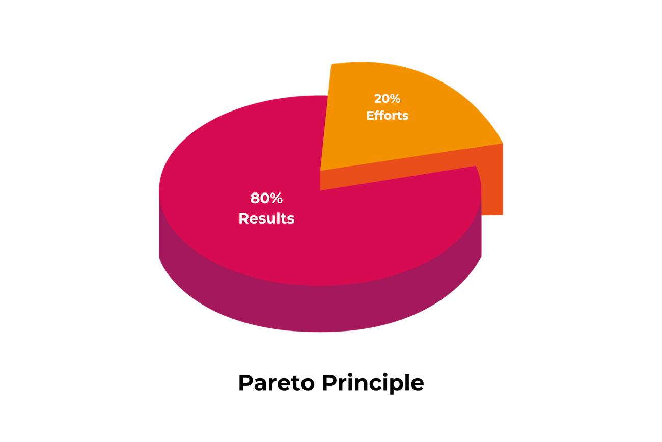
A Pareto chart orders categories by frequency or impact so the team can see concentration. It helps prioritize where to investigate, but it does not prove root cause.
Choose the measure deliberately. The most frequent issue may not create the greatest customer harm, cost, or risk.
5. Cause-and-Effect Diagram
Also called a fishbone or Ishikawa diagram, this tool organizes possible causes under useful categories. It is a hypothesis map, not evidence that every branch contributes to the problem.
After the session, mark which causes have evidence, which require measurement, and which have been ruled out.
6. Five Whys
Five Whys repeatedly asks why an event occurred to move from the symptom toward a process cause. The number five is a prompt, not a rule.
Use it for a defined event with people who know the work. Stop when evidence ends, and avoid turning the exercise into blame. Complex problems often have several interacting causes and need broader analysis.
7. Histogram
A histogram groups numerical observations into intervals to show the shape and spread of a distribution. It can reveal skew, multiple populations, or unusual tails hidden by an average.
Results depend on the data quality, sample, and bin choices. Stratify when several process conditions may be mixed together.
8. Scatter Plot
A scatter plot places paired observations for two variables on axes to reveal possible relationships. It can suggest where further analysis is useful.
Correlation does not establish causation. A third factor, selection effect, or time trend may explain the pattern.
9. Control Chart
A control chart plots a process measure over time with a center line and statistically calculated control limits appropriate to the data. It helps distinguish common-cause variation from signals that may warrant investigation.
Control limits are not the same as customer specification limits. Select the correct chart type and sampling plan with someone who understands statistical process control.
10. Failure Modes and Effects Analysis
FMEA identifies how a product or process might fail, the effects and causes, existing controls, and actions to reduce risk. It is especially useful before a change or where failure consequences matter.
The analysis should lead to owned actions and updated controls, not only a risk-priority score. ASQ’s FMEA resource emphasizes review, high-risk areas, and connection to the control plan.
Where the Tools Fit in DMAIC
| DMAIC phase | Example tools |
|---|---|
| Define | SIPOC, customer requirements, project charter |
| Measure | Process map, check sheet, histogram, measurement-system review |
| Analyze | Pareto chart, fishbone, Five Whys, scatter plot |
| Improve | FMEA, pilot design, error-proofing, solution selection |
| Control | Control chart, control plan, standard work, response plan |
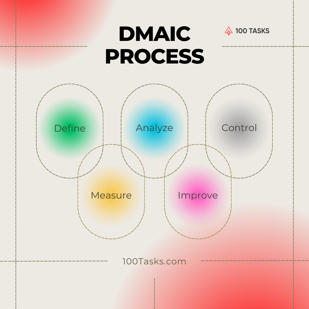
Read the DMAIC process pillar before assembling a toolkit. DMAIC supplies the sequence and decision gates; the tools supply evidence within that sequence.
A Simple Selection Rule
Write the question first, then choose the minimum tool that can answer it with trustworthy data. Do not use a control chart because a dashboard needs a graph, or an FMEA because a template exists.
For a broader strategy comparison, Lean versus Six Sigma explains how flow, waste, variation, and quality questions relate. A well-chosen basic tool applied to a real process is more useful than a sophisticated analysis disconnected from a decision.
Martin Bell
Founder of 100 Tasks. Martin Bell has launched or supported 120+ startups and turned Rocket Internet venture-building discipline into a step-by-step system used by 25,000+ founders and startups.